Bright and Dark Themes

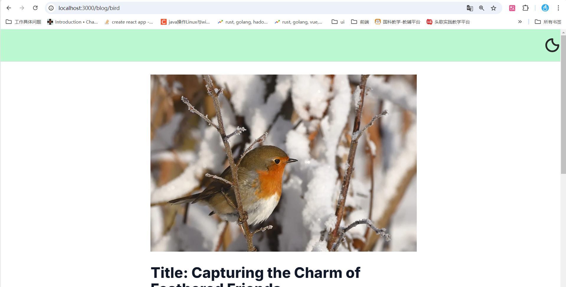
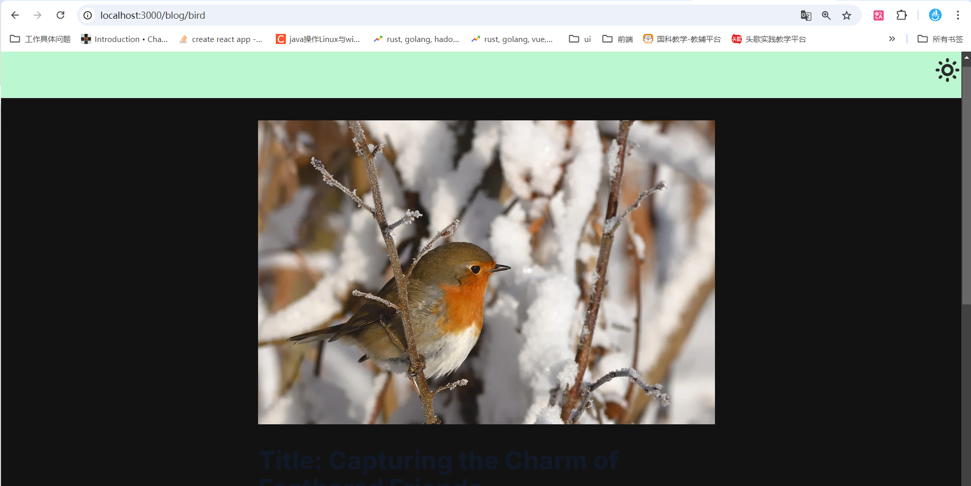
Bright and dark themes refer to themes with light or dark color schemes. Depending on the user’s context
(e.g., daytime or nighttime), providing an option to switch the overall system colors can enhance the visual comfort for
users.

Git Repository

This chapter is part of the Next.js beginner course series. To view the code for this chapter, check out the following
git repository and switch to the extra1 branch:

install next-themes

1
pnpm install next-themes

Configure Tailwind Theme Support

1
2
3
4
5
6
7
8
9
// tailwind.config.ts
import type {Config} from "tailwindcss";

const config: Config = {
// Configure Mode via Class Names
darkMode: ['selector', '.dark'],
/// ...
};
export default config;

Add a Provider in layout.tsx

jsx
1
2
3
4
5
6
7
8
9
10
11
12
13
14
15
16
17
18
19
20
21
22
23
24
// app/layout.tsx
///
import {ThemeProvider} from "next-themes";

/// ...

export default function RootLayout({
children,
}: Readonly<{
children: React.ReactNode;
}>) {
return (
<html lang="en" suppressHydrationWarning>
<body className={inter.className}>
{/*Provide Theme State*/}
<ThemeProvider>
<Navbar/>
{children}
<Footbar/>
</ThemeProvider>
</body>
</html>
);
}

Add a Switch Button in the Navbar

jsx
1
2
3
4
5
6
7
8
9
10
11
12
13
14
15
16
17
18
19
20
21
22
23
24
25
// components/navbar.tsx
"use client";
import {useTheme} from "next-themes";

export default function Navbar() {
// Methods to Get the Current Theme and Set the Theme
const {setTheme, resolvedTheme} = useTheme();

return (
<nav className={'bg-green-200 border-b border-b-gray-300 sticky w-full h-20 flex items-center'}>
<div className={'flex-1'}></div>
{resolvedTheme !== 'dark' ?
// Button to Switch Color Themes
<img className={'size-10'}
onClick={() => setTheme('dark')}
src="https://www.svgrepo.com/show/489517/mode-dark.svg"
alt="to dark theme mode"/> :
<img className={'size-10'}
onClick={() => setTheme('light')}
src="https://www.svgrepo.com/show/489519/mode-light.svg"
alt="to light theme mode"/>
}
</nav>
)
}

Regarding “use client”: This enables client-side features such as JavaScript interactions, browser storage (Storage),
cookies, etc.

Result:

light
light
dark
dark

Add Styles for Dark Mode

Have you noticed that the text style changes in dark mode, while some styles we have specified (in className) remain
unchanged?

We can use dark: to configure styles for dark mode.

jsx
1
2
3
4
5
6
7
8
9
10
11
12
13
14
15
16
17
18
19
20
21
22
23
24
25
26
27
28
29
// components/navbar.tsx
"use client";
import {useTheme} from "next-themes";

export default function Navbar() {
/// ...

return (
<nav className={
`bg-green-200 dark:bg-green-800 ...`
}>
{/*...*/}
</nav>
)
}

// components/footbar.tsx

export default function Footbar() {

return (
<footer
className={
`bg-gray-200 dark:bg-gray-800 ...`
}>
footbar
</footer>
)
}
jsx
1
2
3
4
5
6
7
8
9
10
11
12
13
14
15
16
17
18
19
20
21
22
23
// app/blog/[slug]/page.tsx

export default async function BlogPage({
params,
searchParams,
}: {
params: { slug: string }
searchParams: {}
}) {
/// ...

return (
<div className={'w-screen flex flex-row justify-center'}>
{/*
Prose ensures that headings within the text have corresponding styles.
`dark:prose-invert` is used to adapt prose for dark themes.
*/}
<div className={`prose dark:prose-invert`}
dangerouslySetInnerHTML={{__html: html}}>
</div>
</div>
)
}

Result:

End

Thanks for watch!


本站总访问量